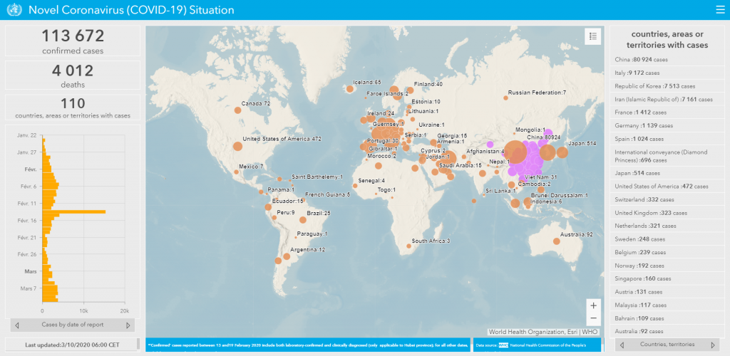
As Coronavirus spreads the World Health Organization has shared a mind-blowing map of the Coronavirus Evolution worldwide in real-time.
It’s hard to understand how fast the Coronavirus is spreading all over the world until you see it represented in a graphic. This time is the WHO (World Health Organization) who’ve built a real-time map of the evolution of the Coronavirus.
You can obviously see that China is the most affected country worldwide but many countries in Europe are following its steps. You can also see the first cases in South and Central America that have just started being reported last week.

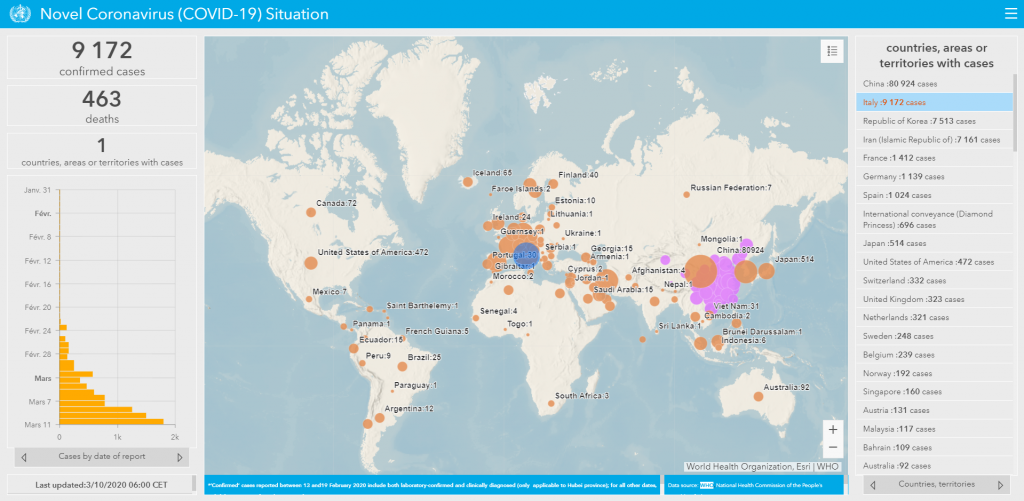
By clicking on any country on the right side of the map you can see the daily evolution of the cases. In Italy for example you can see that the cases have increased exponentially since the beginning of March.

Here are 3 things that have surprised me the most:
1) How could Italy become the second most hurt country after China.
2) How come Russia has only 7 cases (so far).
3) Does North Korea actually have 0 cases or they’re hiding something as always?
Which of these facts surprise you the most? Anything else has caught your attention?
You can find this map HERE.
Let me know below 😉
